Kuro@lemmy.caM to Connect for Lemmy App@lemmy.ca · edit-21 year agoNew logo and we're two months old today!lemmy.caimagemessage-square4fedilinkarrow-up12arrow-down10
arrow-up12arrow-down1imageNew logo and we're two months old today!lemmy.caKuro@lemmy.caM to Connect for Lemmy App@lemmy.ca · edit-21 year agomessage-square4fedilink
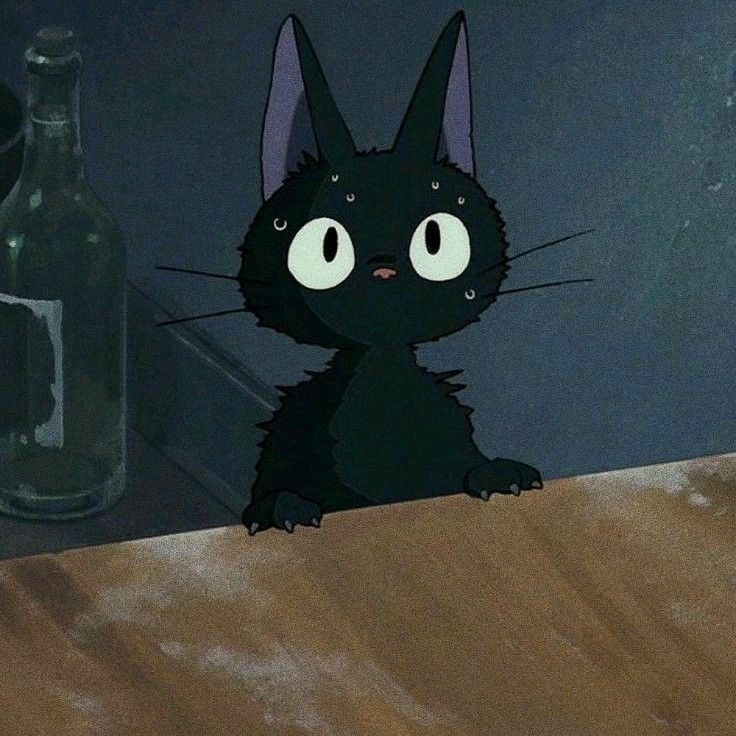
minus-squareharl3k1n@feddit.delinkfedilinkarrow-up0·1 year agoThe details such as ears, whiskers, nose are way too small. They’re hardly recognisable on a mobile device, app icon wise. I love the app but the new icon / logo not so much.
minus-squareTheWaterGod@lemmy.calinkfedilinkEnglisharrow-up0·1 year ago100% agree. I really enjoy the app and Kuro has done amazing work, but this logo misses the mark tbh. I’m definitely no graphics designer (just someone who knows enough to make shitty memes), but the alignment is all over the place with this logo.
minus-squaretrinitrotoluene@lemm.eelinkfedilinkarrow-up0arrow-down1·1 year agoIf it were centered it would be offcenter

The details such as ears, whiskers, nose are way too small. They’re hardly recognisable on a mobile device, app icon wise.
I love the app but the new icon / logo not so much.
100% agree. I really enjoy the app and Kuro has done amazing work, but this logo misses the mark tbh. I’m definitely no graphics designer (just someone who knows enough to make shitty memes), but the alignment is all over the place with this logo.
If it were centered it would be offcenter